Overview
The Octanist dashboard brings together leads, ad spend, revenue, and performance metrics from every connected platform into one unified view. No more switching between Google Ads, Meta Business Manager, and spreadsheets. Everything is in one place, updated in real-time.
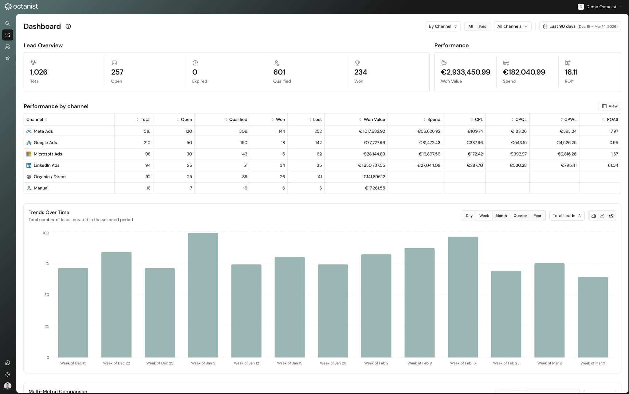
KPI cards
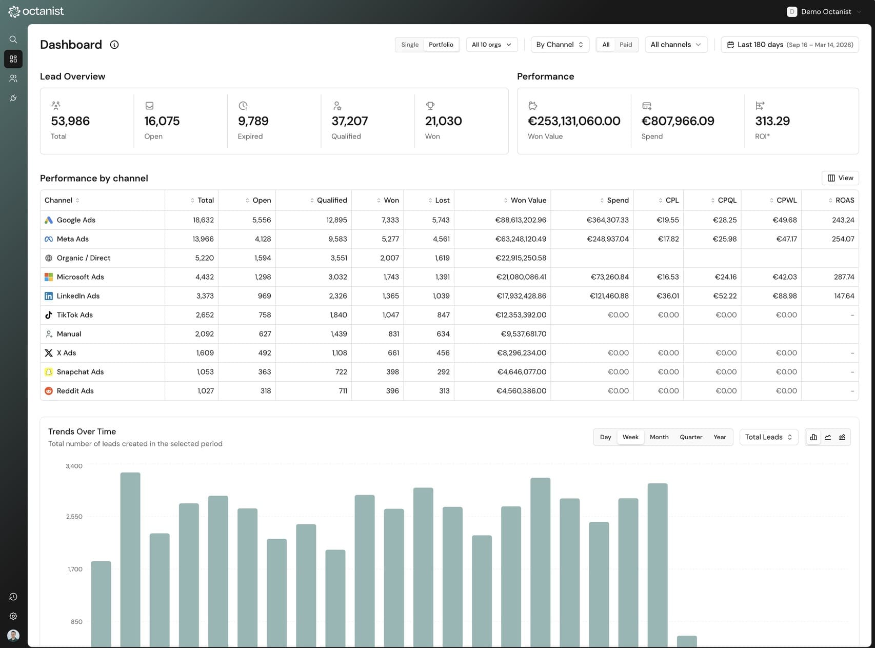
The top of the dashboard shows 8 key metrics at a glance, split into two groups: lead overview and performance. Each card shows the current value and, when period comparison is enabled, a percentage change badge showing growth or decline versus the previous period.
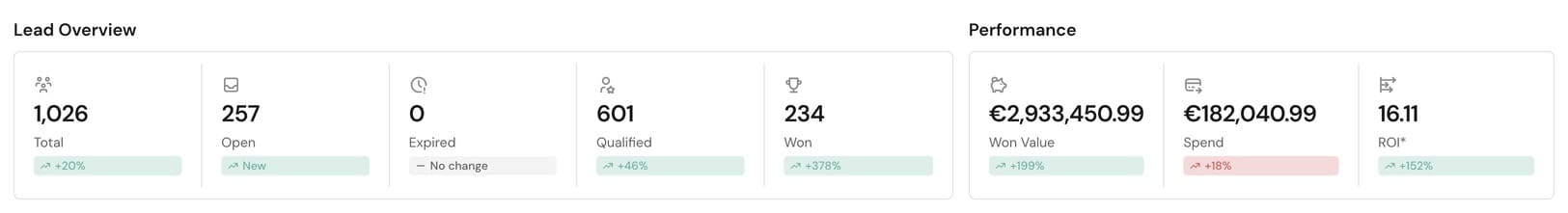
Lead overview
- Total Leads: all leads created in the selected period
- Open: leads awaiting qualification
- Qualified: leads marked as qualified
- Won: successfully converted leads (clickable → filters to leads page)
- Expired: leads past the 90-day window
Performance
- Value Won: total revenue from won leads
- Total Spend: ad spend across all connected platforms
- ROAS: return on ad spend (value won ÷ total spend)
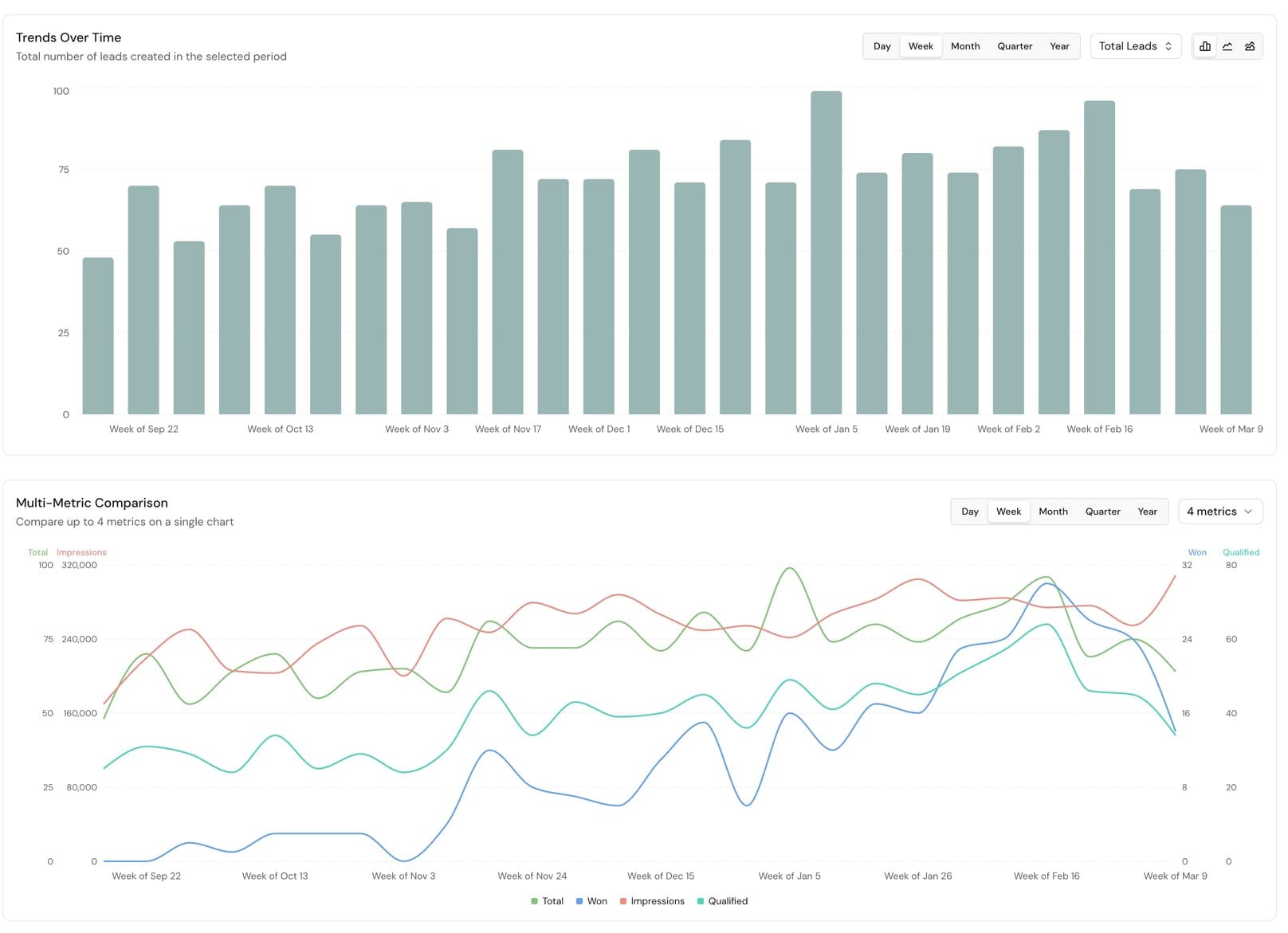
Charts & visualizations
The dashboard includes multiple chart types for different analysis needs. Every chart supports metric selection, interval toggles (day/week/month/quarter/year), and optional period comparison.
Trends over time
Bar, line, or area charts showing any metric over time. Toggle intervals from daily to yearly. Enable period comparison to overlay the previous period as a dashed line.
Dimension breakdown
Stacked bar, line, or area charts breaking down metrics by channel, source, campaign, or any other dimension. See which channels drive volume over time.
Outcomes
Three donut chart views: won/lost ratio (with win % center label), value breakdown (won vs lost revenue), and ROAS overview (spend vs revenue).
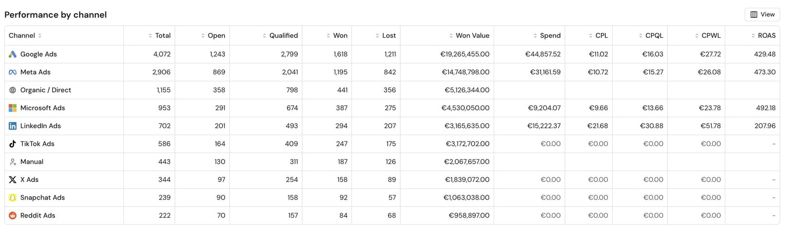
Comparison table
A sortable table with 15+ customizable columns including CPL, CPQL, CPWL, ROAS, qualification rate, and win rate. Columns saved per user.
Performance comparison table
The performance table is the most detailed view in the dashboard. It breaks down every metric by the selected dimension and supports sorting by any column. When period comparison is enabled, each row shows the previous period values with change indicators.
Available metrics
- Count metrics: Total Leads, Open, Qualified, Won, Lost, Expired
- Value metrics: Value Won, Value Lost, Average Lead Value
- Cost metrics: Total Spend, CPL, CPQL, CPWL
- Rate metrics: Qualification Rate, Qualified Win Rate, Won Rate
- Ratio metrics: ROAS, Won:Lost Ratio
Period-over-period comparison
Compare any two date ranges side by side. When you enable period comparison, the dashboard automatically calculates the previous period of equal length, or you can set custom comparison dates.
Comparison data appears everywhere: percentage change badges on KPI cards, dashed overlay lines on time series charts, and sub-rows in the comparison table. This makes it easy to answer "are we doing better than last month?" at a glance.
Channel & campaign breakdown
All dashboard views support 5 breakdown dimensions, giving you different levels of granularity depending on what you need to analyze.
- Channel: platform-level, Google Ads, Meta, Microsoft Ads, LinkedIn, Organic, and Manual
- Source: UTM source parameter (e.g., "google", "facebook")
- Source / Medium: combined (e.g., "google / cpc")
- Source / Medium / Campaign: full UTM stack
- Campaign: UTM campaign parameter only
Portfolio view for agencies
Agencies managing multiple client accounts can use portfolio view to aggregate metrics across all organizations. A toggle in the dashboard header switches between single-org and portfolio mode.
In portfolio mode, you can select which organizations to include using a popover with checkboxes. All KPIs, charts, and tables aggregate data from the selected organizations in a single server call. No per-client loading.

Automatic ad spend syncing
Ad spend data is pulled directly from Google Ads, Meta Ads, and Microsoft Ads daily, including cost, clicks, and impressions per platform per day. This means ROAS, CPL, and other spend-dependent metrics are always up to date without manual CSV imports.